

We’re back, back, back with another edition of Box Art Brawl!
Last week we looked at three Contra: Hard Corps covers for Sega Genesis/Mega Drive. Despite three (in our opinion) pretty nice designs, the vote wasn’t even close. You guys picked the North American version as the clear winner with 64% of the vote, while Japan and Europe received the remaining 29% and 7% respectively.
This time we’re shooting into the future by comparing two different covers for Astro Boy: Omega Factor on the GBA. This sideways beat/shooter game was released by SEGA (THQ in Europe) in Japan, North America and Europe in 2003, 2004 and 2005, staggered to coincide with the premiere of the TV anime in the US. It’s a treat for fans of Astro Boy and Osamu Tezuka’s wider body of work, with fast-paced action and beautiful pixel art to boot.
Europe and North America have opted for the same design, so we have an old-fashioned duel here, pitting the common design against the Japanese variant. Let’s get into it…
Be sure to cast your vote in the poll below. But first, let’s take a look at the box art designs themselves.
Europe / North America
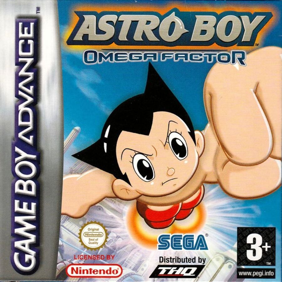
The European and North American cover is all about action. There’s no denying what this game is about, with Astro Boy flying right at us, front and center. It’s certainly a somewhat simplistic version, but we respect the “matter of fact” nature of it all. You may not know what the game is about, but you certainly know its star.
Japan
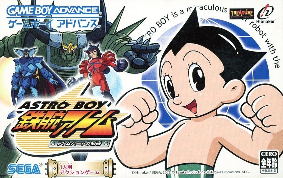
Now for something different! The Japanese cover takes advantage of the wider regional box design and still puts Astro Boy front and center, but also leaves some room for the villains by having Blue Knight, Atlas, and Pluto stand menacingly above the title. Since the animated series is already popular in Japan, it makes sense that the design shows off a bit more of what’s on offer, although we feel that this one looks a bit cluttered compared to the simplicity of what we’ve seen before. Hmmm.

Thanks for voting! See you next time for another round of Box Art Brawl.


