

Be sure to cast your vote in the poll below. But first, let’s take a look at the box art designs themselves.
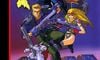
North America
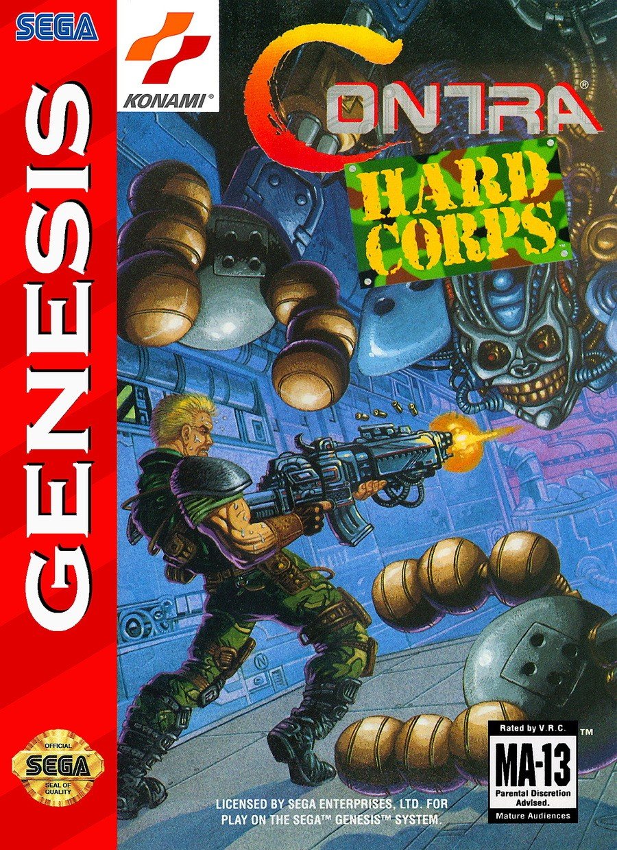
That’s awesome, right? It’s perhaps the most recognizable of the three designs. It features one of the game’s protagonists, blond Ray Poward, shooting at a fearsome enemy. It’s a cool design and you really get a sense of the size of the weapon through Ray’s stance; almost as if he’s going to collapse under the sheer weight of the thing.
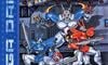
Europe
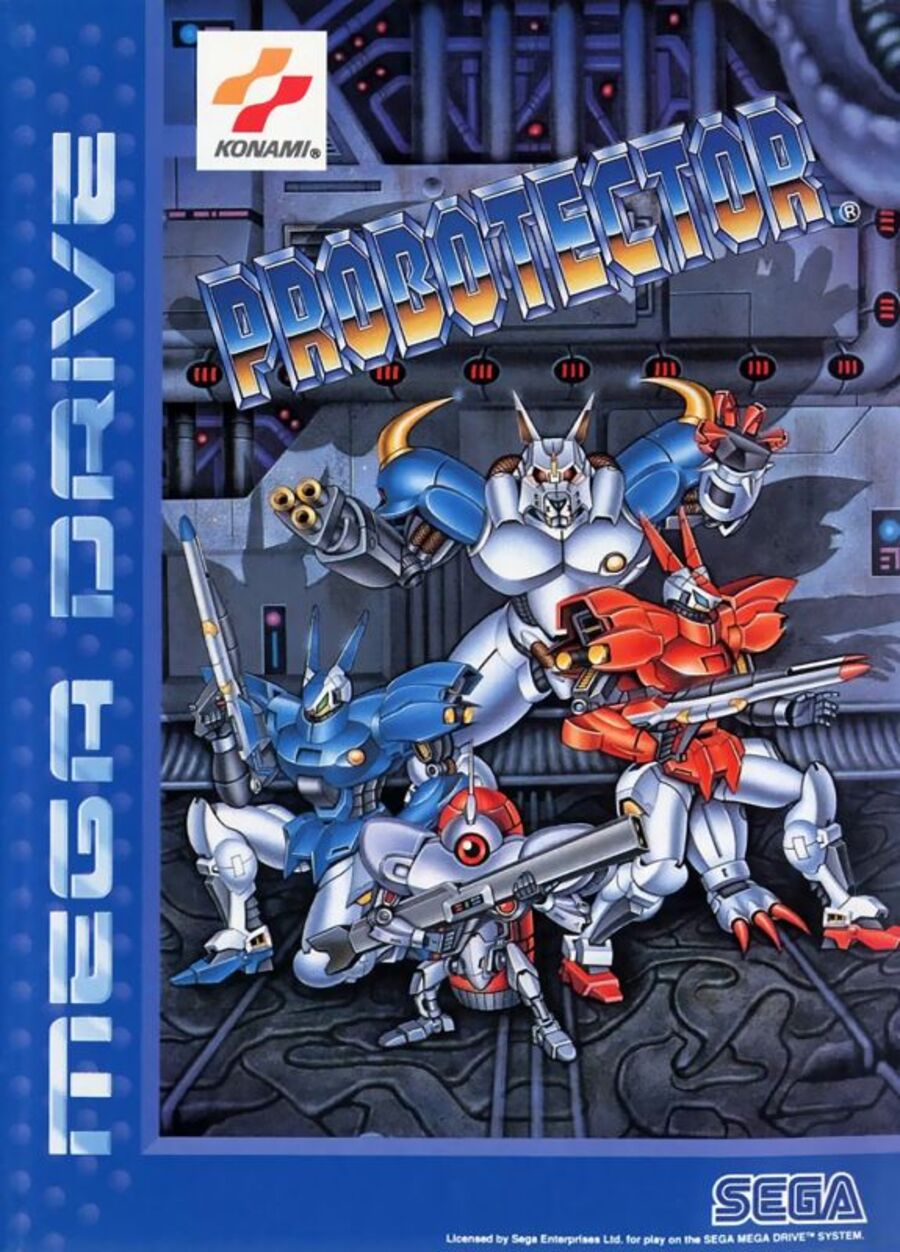
In Europe, things are a little more lighthearted. The group of robots on the cover look like they came straight out of a Saturday morning cartoon. They definitely lack the attitude of North American design, but it’s still a fun, colorful little composition.
Japan
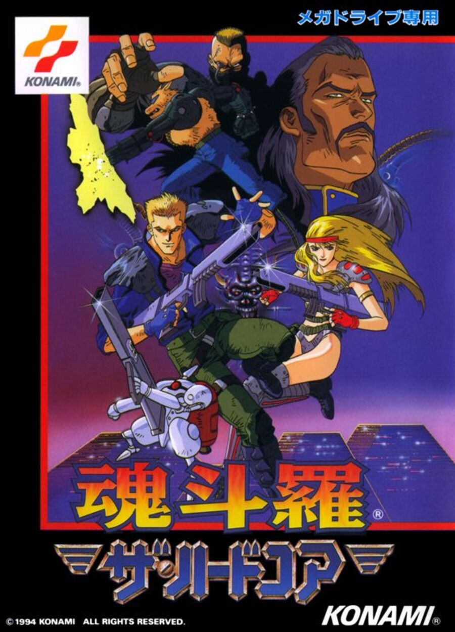
The Japanese version leans more towards an anime aesthetic, featuring various characters from the game against a Blade Runner-inspired backdrop. It’s a cool, dynamic composition that makes good use of space with some pretty badass poses from our protagonists, but it still lacks some of the signature attitude of the North American version.
Thanks for voting! See you next time for another round of Box Art Brawl.


