

If you love decorating your home in calming, neutral colors, Sherwin-Williams’ latest color palette is for you. Inspired by romance, this color palette is an elevated take on neutrals, and each color is incredibly versatile for many decorating styles.
While stark whites and cool greys are quickly dismissed as boring, earthy neutrals that offer more depth and warmth are becoming increasingly popular, and this palette fully embodies that cozy approach.
We spoke with interior designers and color experts at Sherwin-Williams to learn more about this calming color palette. Read on to learn how to best decorate your home with color ideas inspired by this color scheme.
The palette includes five shades, all suitable for decorating with neutral colours. Classic Light Bluff SW 0050 is a versatile warm white shade that is suitable as a background colour in any room; Renwick Rose Beige SW 2804 is a muted terracotta; and Sycamore Tan SW 2855 is a cool beige. The last two shades are slightly darker tones: Smoky Blue SW 7604, a muted blue-grey; and Avocado SW 2861, a muddy green.
“This palette was inspired by Romantic art,” says Emily Kantz, Color Marketing Manager at Sherwin-Williams. “With its deep pinks, earth tones and creamy whites, it reflects the emotional and mysterious nature inherent in these historic works of art from the Romantic design period.”
“There’s been a resurgence of this new romanticism lately: many people are drawn to these authentic earth tones, which have a layered complexity in their muted beauty. After years of stark whites and grays, these tones add an element of quiet elegance.”
How to decorate with the color palette of romance
All five colors in the palette are slightly muted, making them incredibly versatile. Whether you use them to infuse a room with color or as an accent color, each color creates a calming feeling that feels vibrant and timeless.
Interior designer Melissa Read, creative director at Studio Burntwood, recommends using avocado on kitchen cabinets for a trendy look. “Avocado looks wonderful on kitchen cabinets, the green gives it a fresh and vibrant look. Pair it with Carrara or Calacatta marble countertops and natural wood pieces for a balanced space.”
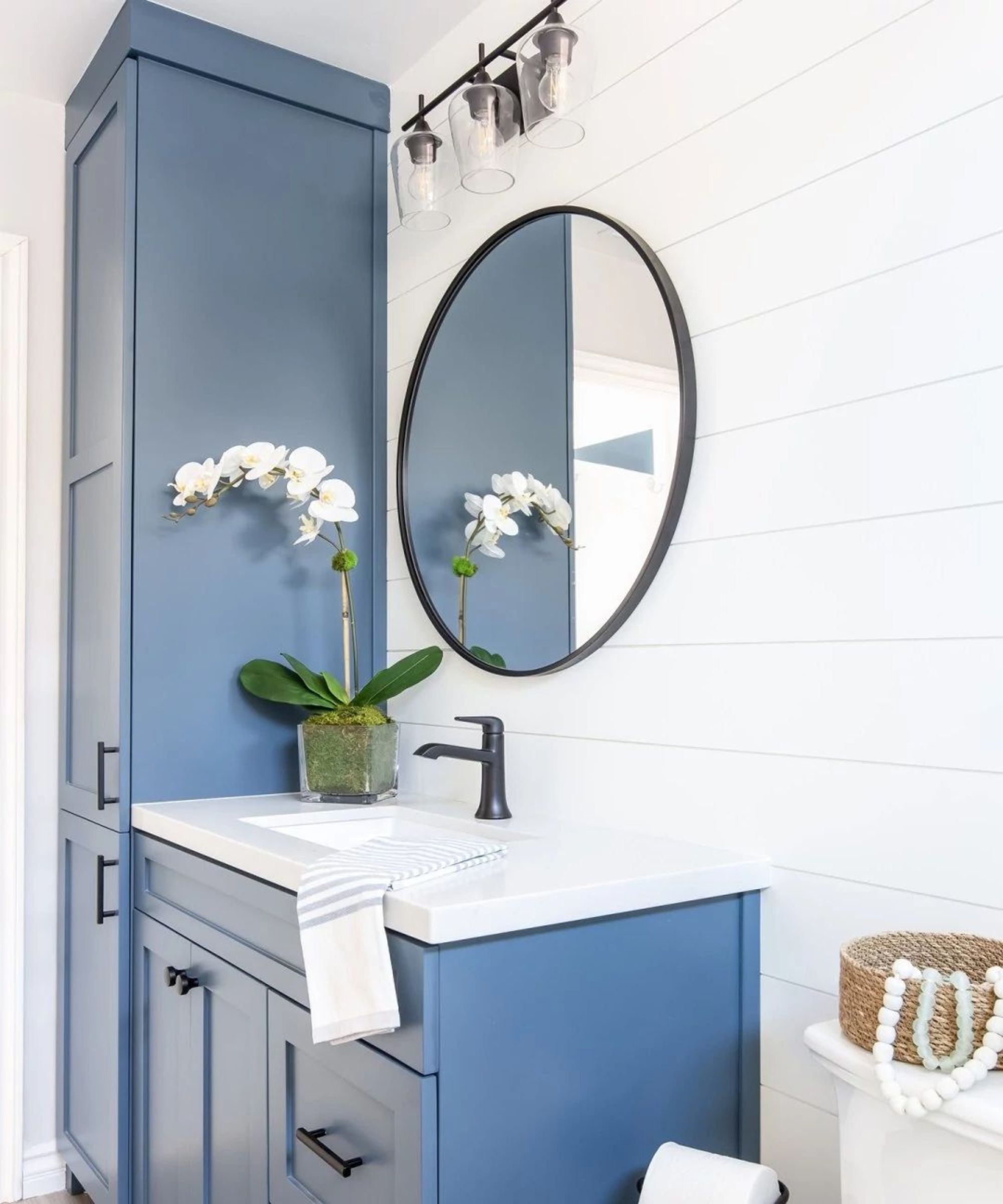
Smokey blue is a great choice for a slightly more colorful take on neutrals and works well in bathrooms when paired with white for a coastal decor scheme, as seen here. Alternatively, Melissa suggests using it in home offices for a calming and grown-up color scheme.
“Smokey Blue is an excellent choice for a home office as it creates a calm, focused atmosphere. Pair it with Classic White Buff for contrast and a more classic and sophisticated look.”
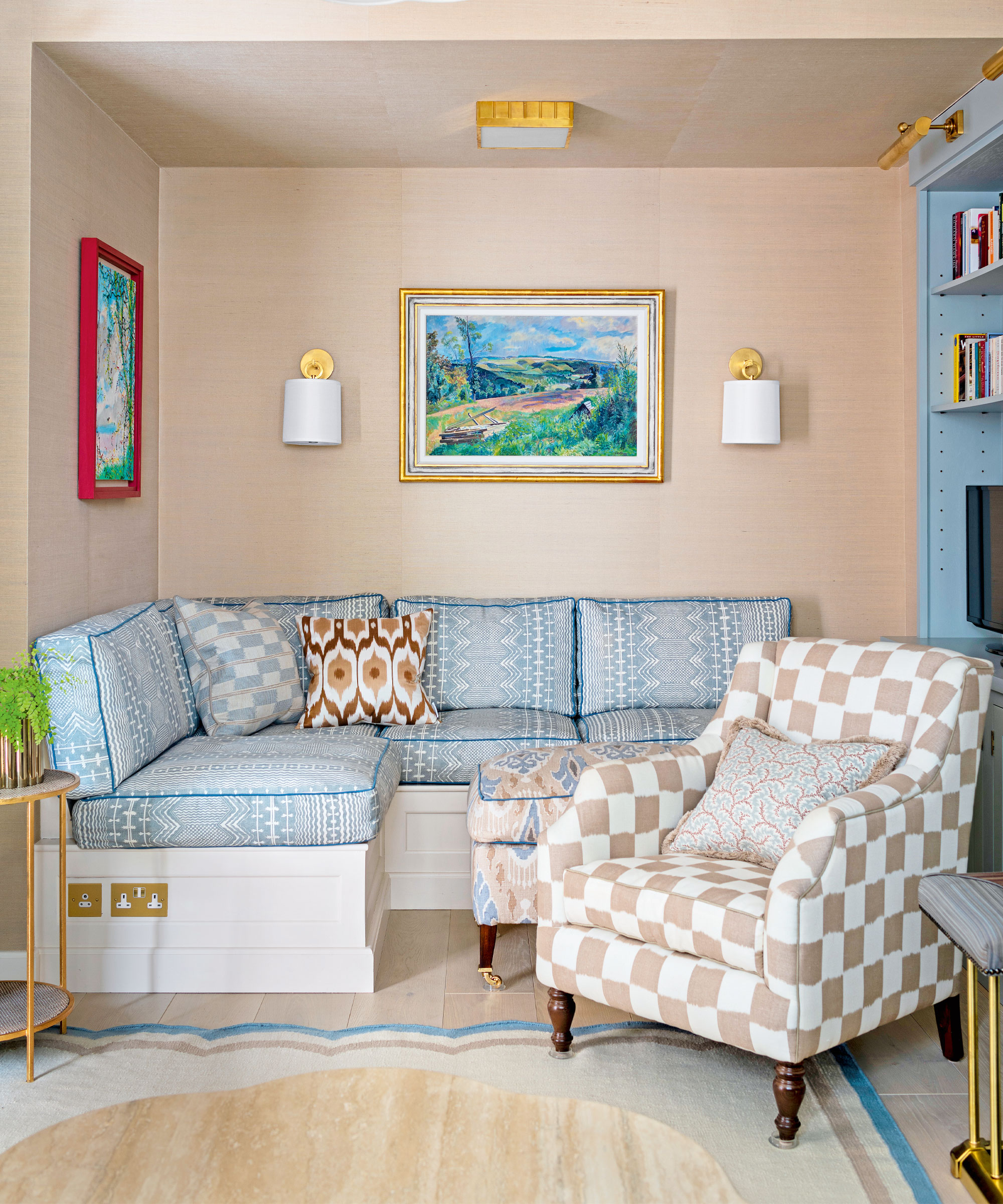
Both Sycamore Tan and Renwick Rose Beige are good options for creating a simple and cozy feel. In a living room, use one of these shades on all four walls as a warmer alternative to white, similar to this small living room with colorful decor.
Alternatively, Melissa adds that these two warm neutrals would also work well in bedrooms and bathrooms: “Sycamore Tan is ideal for a bedroom or bathroom, creating a warm, intimate space. Renwick Rose Beige evokes a feeling of comfort and relaxation, perfect as a wall colour or joinery in the bedroom. Combine it with brass or gold accents for a stylish touch.”
If you prefer lighter neutrals, opt for Classic Light Buff and use it as the main color in a living room to create a timeless look that will stand up to trends. “I love neutral wall colors because they’re perfect for framing a room’s decor and letting it speak for itself,” says interior designer Kathy Kuo.
While light neutrals can quickly become dull, make sure the rest of the room’s decor reflects personality, as Kathy suggests: “There are so many ways to create an interesting and eye-catching interior design motif against a neutral background. Have fun with wall art, lighting ideas and decorative accents!”
Neutral colors are the most timeless colors for interior design and add a calming atmosphere to any room they are used in. With these five trendy neutral colors, you can create a calming space while creating a cozy atmosphere – from the kitchen to the bathroom.


